A private, offline finance ledger in one HTML file — and the eight screens that show it exercising judgment rather than running validation.
Rev 1.6.0 · captured 1 August 2026 · synthetic dataset, 352 transactions across 19 months
The decision every artifact below is testingNotice it, price it, and then decline to assume. Software that finds a problem
usually does one of two things — stays silent, or declares you wrong. This app does a third:
it states what it sees, quantifies what the mistake costs, and then names the case where
the user is right after all. That pattern is the product, and it repeats on every screen here —
in the integrity check, in the split that reconciles to the cent, in a lock screen that admits
there is no way back in.
01 The integrity check — the one screen where it disagrees with you
DecisionA warning that only says something looks wrong pushes the work back onto the user.
Name the amount, name the consequence in the units the user actually cares about, and concede the
case where they meant it.
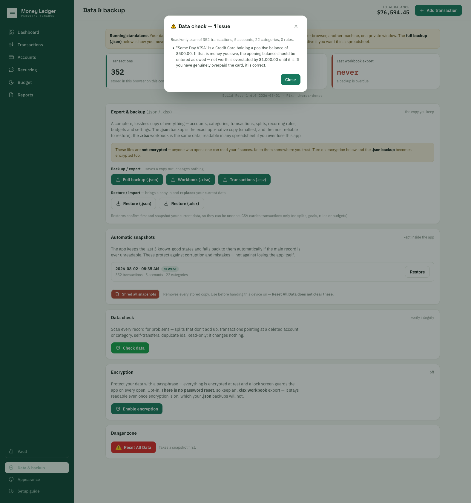
Data check — one issue, three moves in a single sentence. It notices a credit card
holding a positive balance — you just wait a minute, mister. It prices the error —
$500 with the wrong sign costs
$1,000.00 of net worth, because the money is simultaneously not counted as debt and
counted as an asset. Then it declines to assume: “If you have genuinely overpaid the
card, it is correct.” Overpaying a card is a real thing people do, so the app says what it
sees and stops short of calling it a mistake. The surface behind the dialog is the argument —
an automatic snapshot taken without being asked, an honest “last workbook export: never”,
and a control to shred every stored copy before you hand the device on.
This is also the rule the documentation had backwards. The shipped guide told users to
enter what they owe as a positive number; the app was enforcing the opposite in software, and the
guide was corrected to match it. The product was right and the manual was wrong —
which is the correct direction for that error to run.
02 At a glance — and one decision visible without a caption
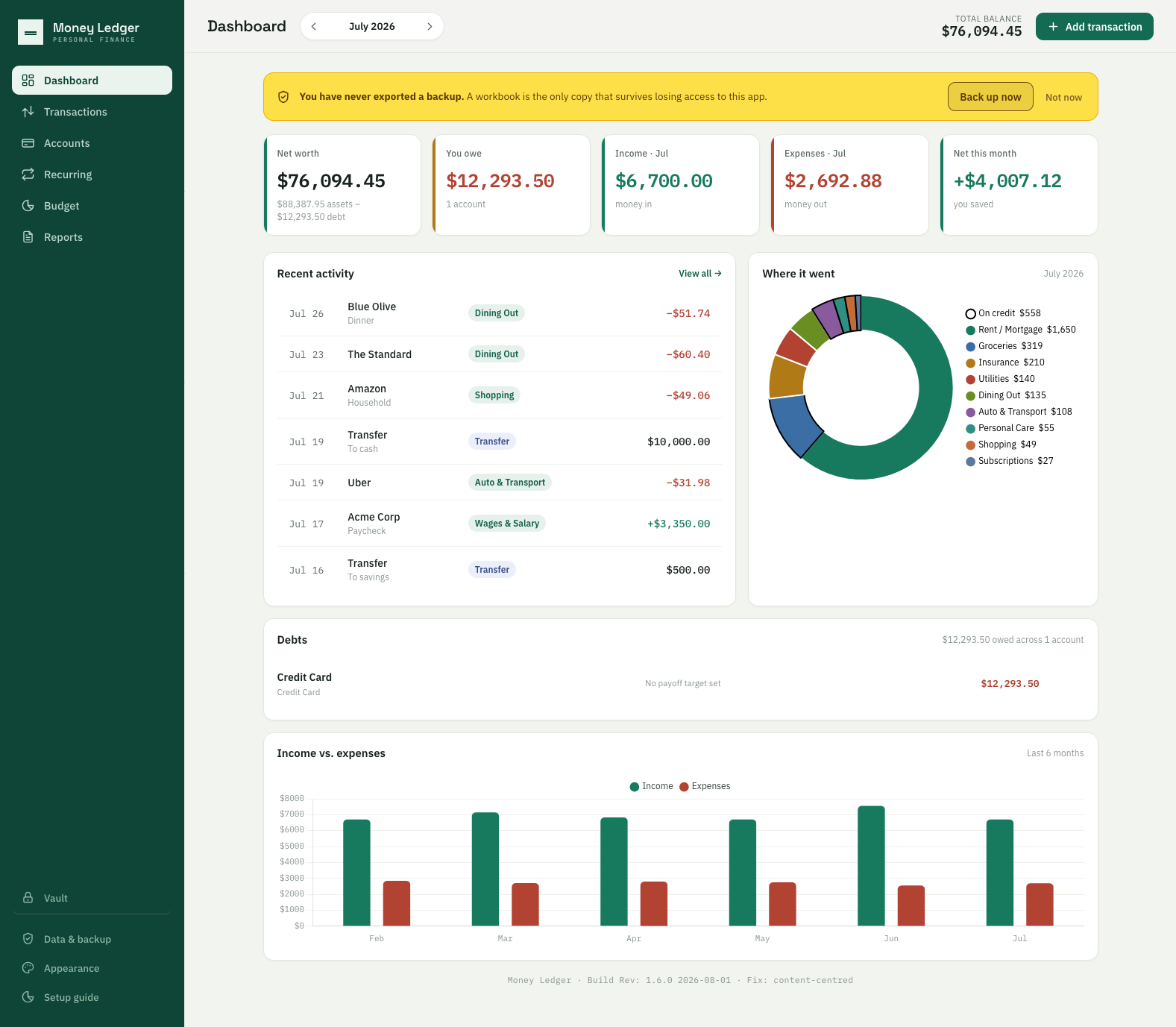
DecisionSpending-by-category is a solved chart. The unsolved part is that money spent on credit is
not money spent from an account — most tools quietly merge the two.
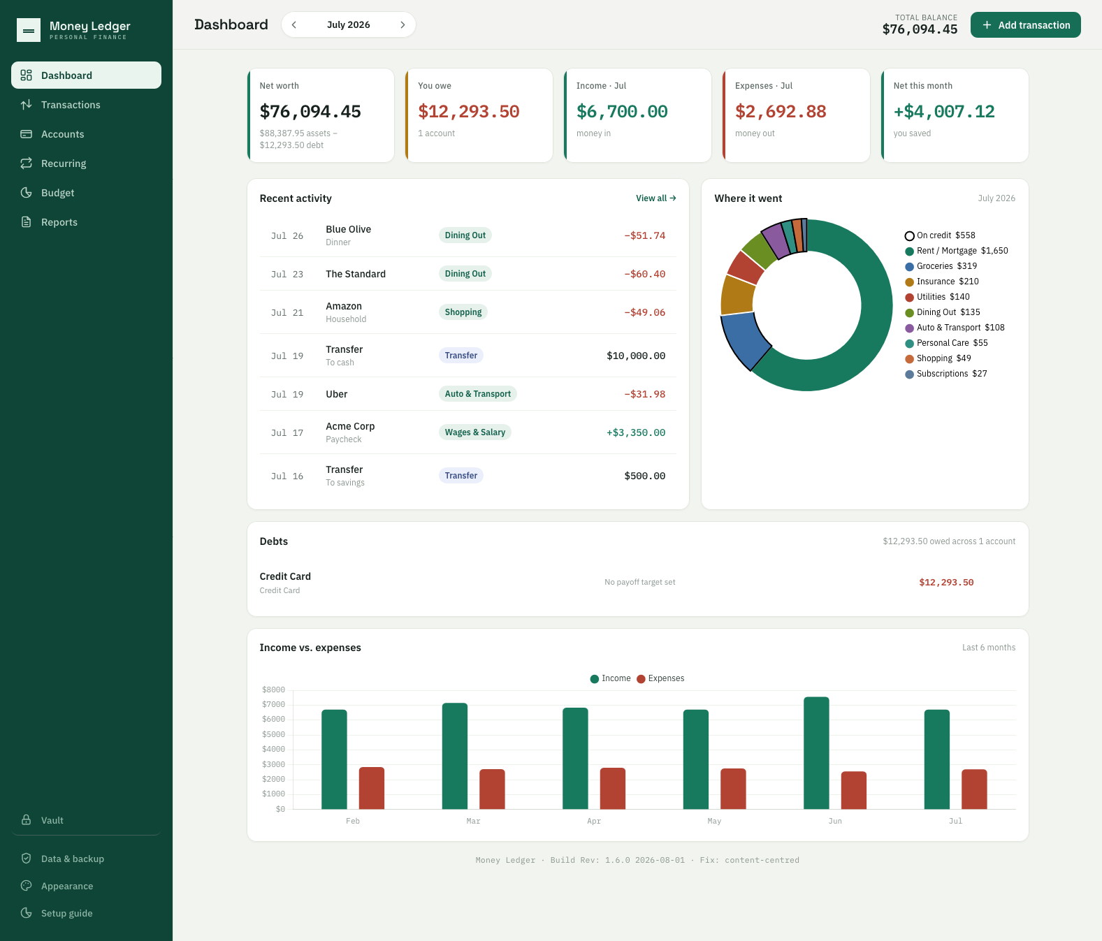
Dashboard — July 2026. Net worth $76,094.45 shown with its own working
underneath ($88,387.95 assets − $12,293.50 debt) rather than as a number you have to trust.
The strongest thing in the frame is “On credit $558” carrying its own outlined ring in the
donut — a spend that has not left an account yet, given a visually distinct treatment
instead of being folded in with the rest. Every figure here was verified against the source
file before this shot was promoted, not eyeballed.
03 Eleven themes, and whose pictures they are
DecisionA tool you open every week should not feel like a tax form — but a theme system is only a
craft argument if the imagery is yours. Scraped wallpaper in a portfolio about authorship is an
own goal.
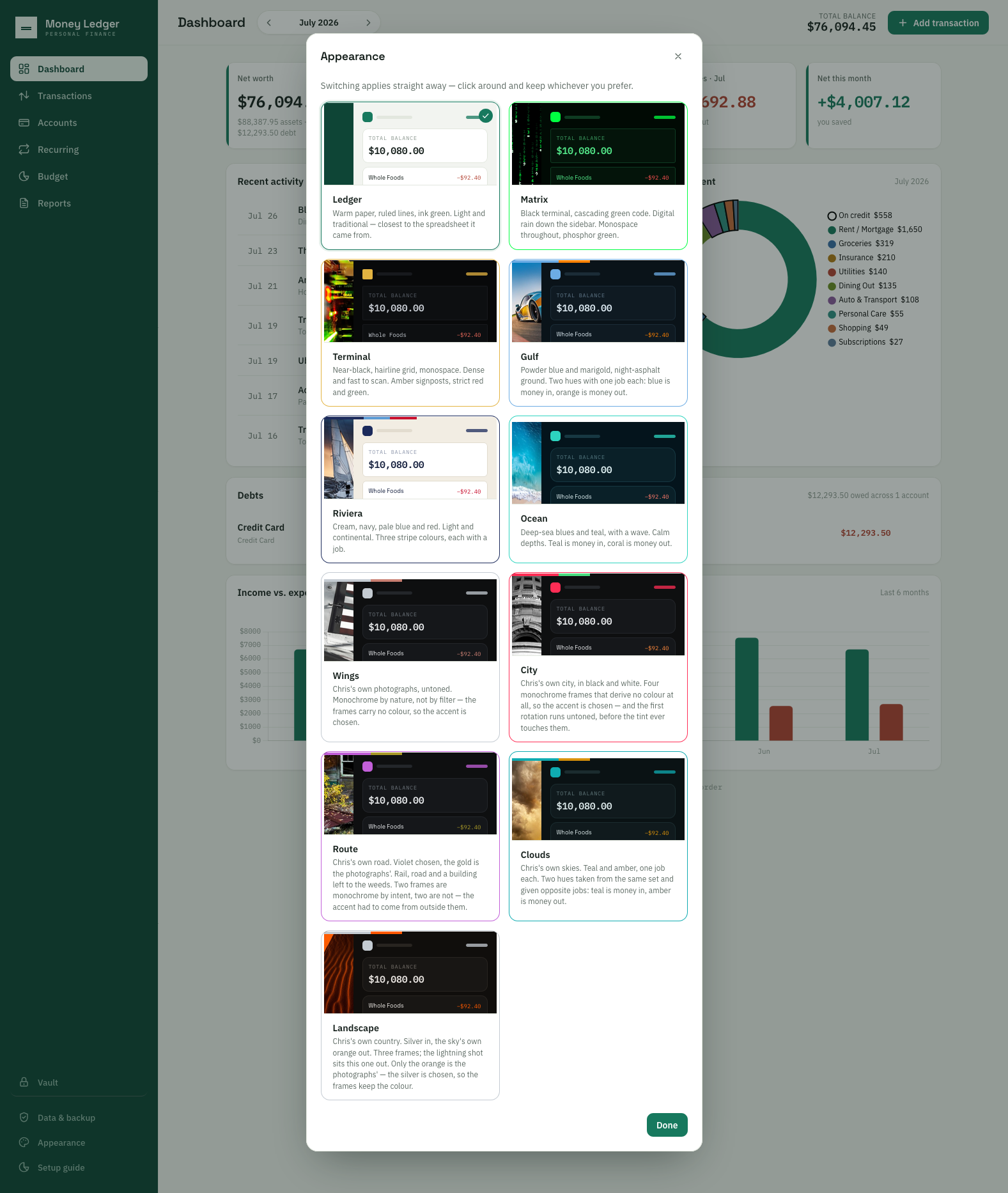
Appearance — eleven themes, each previewed on the same seed ledger. The three
non-photographic themes lead (Ledger, Matrix, Terminal), then the eight image-backed ones.
The descriptions explain the color decisions rather than naming them — “Two hues
taken from the same set and given opposite jobs”, “the frames carry no color, so the
accent is chosen.” Ledger sits first for a structural reason as well as a visual one: it
supplies the default palette and is the fallback the theme loader falls back to.
Why this screen took a week longer than the others
Four of these themes were built on wallpaper of unknown origin. Christopher raised it himself
rather than being told — “Some of the themes hold screen-scraped images. Should we
include those anyway?” — and the fix was not to crop them out of frame. Three were rebuilt
from generations he art-directed; one was deleted outright. Every frame in this grid is
now either a photograph he took or an image he directed. Cropping the grid to hide the
others would have traded a provenance problem for an honesty one.
04 One receipt, three budgets, reconciled to the cent
DecisionA split editor that merely accepts three numbers proves nothing. One that runs the total and
tells you whether it reconciles is doing the work.
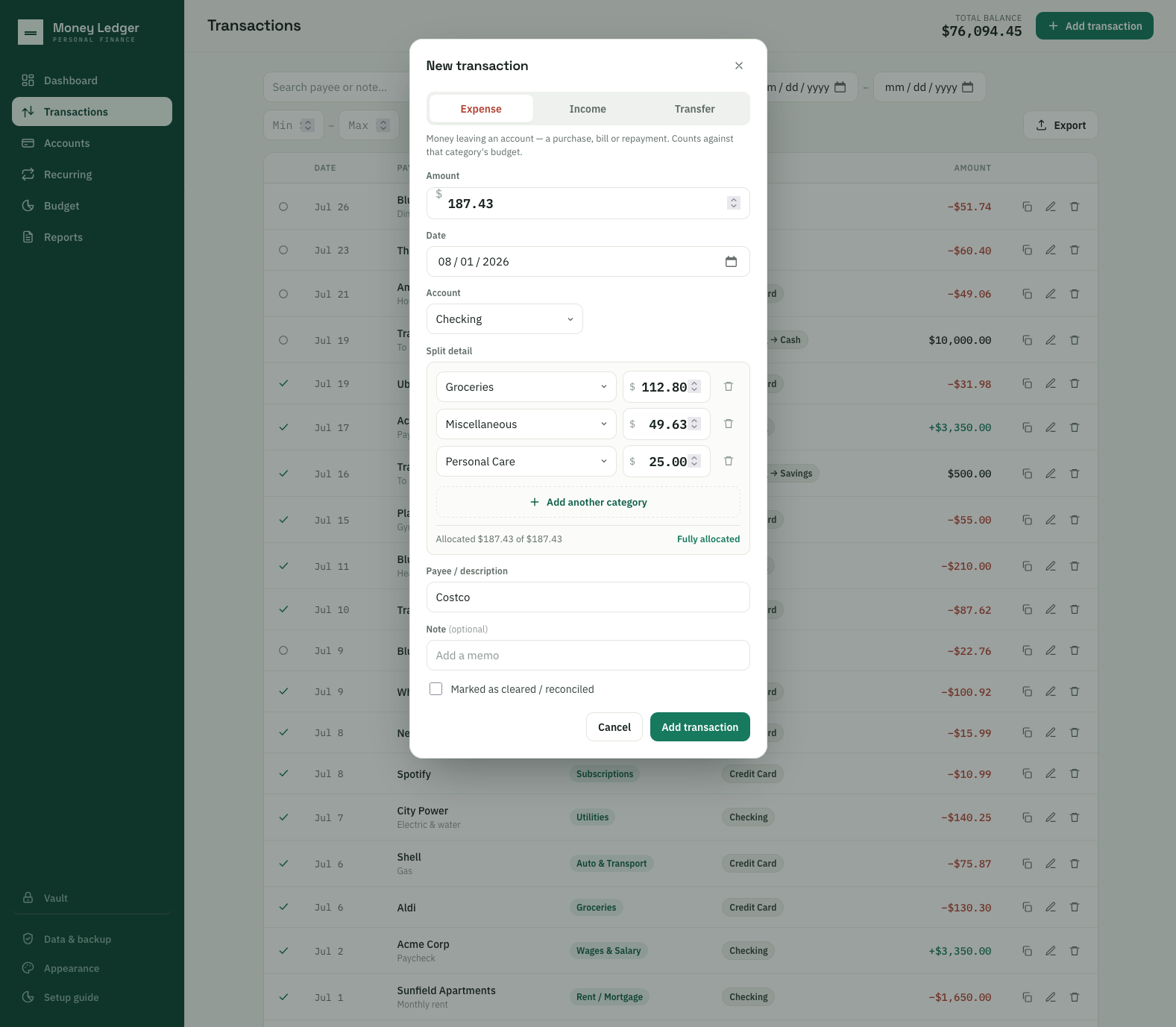
Splitting a single receipt across three budgets. The line carrying the shot is
“Allocated $187.43 of $187.43 · Fully allocated.” The same rule is enforced deeper down —
the integrity check in §01 carries a split total ≠ amount condition — so the modal is
surfacing a constraint the file format holds itself to, not a bit of interface politeness.
A spreadsheet makes this painful: one row, one category, or a formula nobody maintains.
Having every report, chart and budget line account for the three parts correctly is the domain
depth the case study claims.
05 It names the entry that explains the gap
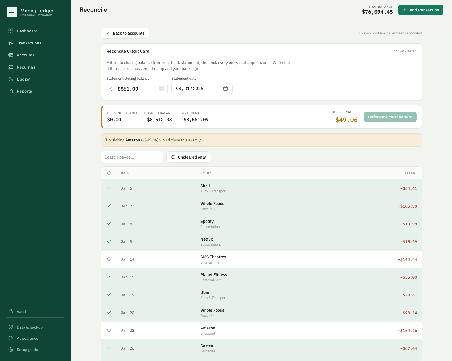
DecisionMost reconciliation UIs stop at “you are out by $49.06.” Finding which transaction
accounts for the difference is the part that is actually tedious — so do that part.
Reconcile — the “closes the gap” hint. The hint has three forms and only one is worth
showing: it names a single entry when exactly one unticked transaction matches, otherwise it says
“N entries would each close this” or “no single entry accounts for this.”
Reaching the good one meant deriving the target from the data — a cleared total of
−$8,512.03 against a statement of −$8,561.09 leaves a gap of exactly $49.06,
the effect of one unticked charge. Every intermediate figure in the frame matches that
derivation.
06 A period is not an instant
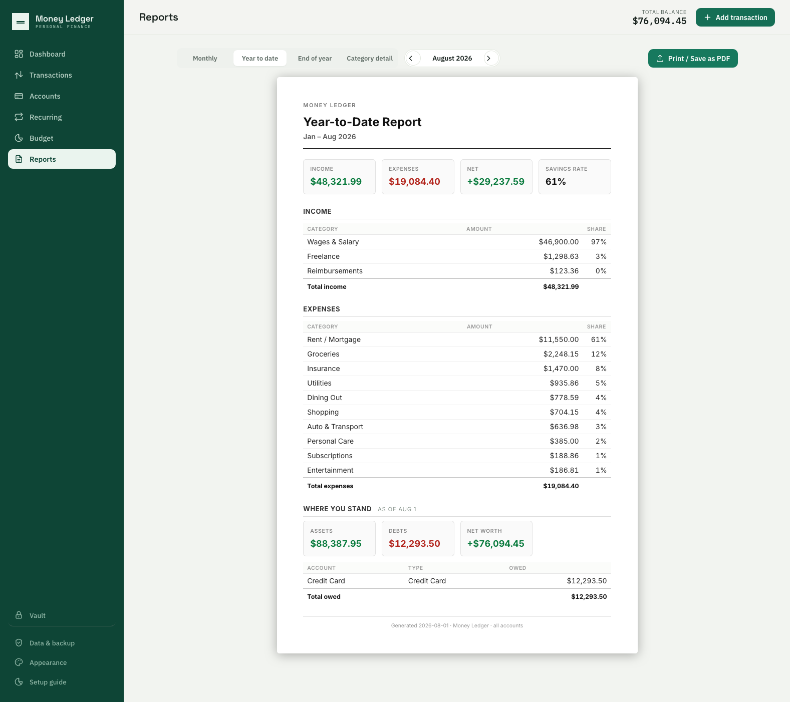
DecisionIncome and expenses are flows measured over a span. Balances are a fact about one moment.
Printing today's debt on a report headed “March 2025” would be quietly misleading — so refuse to.
Reports → Year-to-date, August 2026. Flow above — income $48,321.99, expenses
$19,084.40, net +$29,237.59, a 61% savings rate. Balance sheet below, stamped
“as of Aug 1.”The section is deliberately suppressed on any report whose period ends
before the current month, which is why this had to be shot in August: a July report hides it
entirely rather than printing a present-tense balance under a past-tense heading. That
distinction is ordinary in accounting and rare in personal-finance software. The report renders
as a ~720px sheet centered on the app background — it reads as paper on a desk, which the
Print / Save as PDF button beside it makes literally true.
07 Density handled without clutter
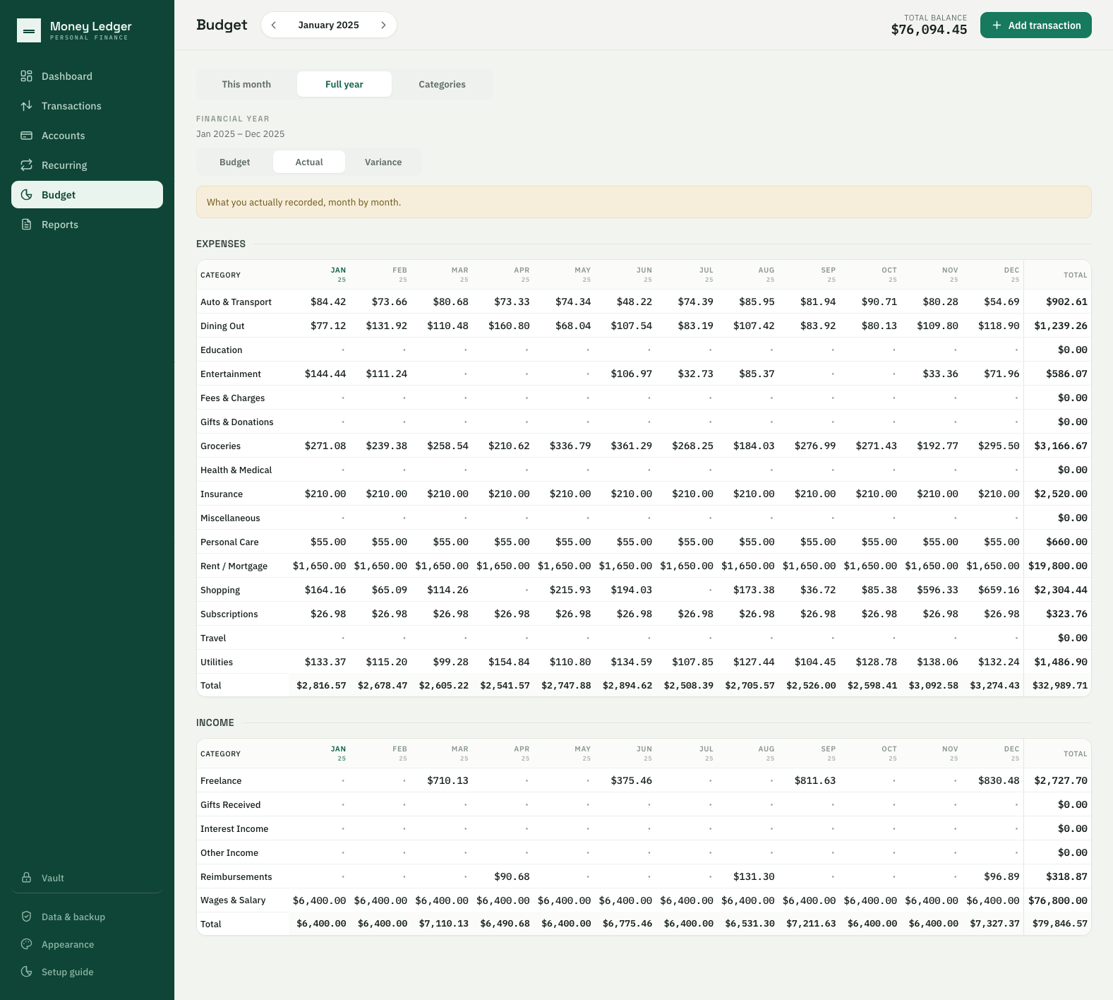
DecisionTwelve months by twenty-two categories is 264 cells. Showing everything and shouting about
nothing is a typography and restraint problem, not a data problem.
Budget → full financial year, actuals for 2025. Every total was verified against the source
file before promotion, not eyeballed: expenses $32,989.71, income $79,846.57,
Rent $19,800.00 across twelve untouched months. The nine empty categories are the
point of the shot. Education, Travel, Health & Medical and the rest show a dim
· rather than a wall of $0.00 — while the Total column still reads
$0.00 where the zero is genuinely the answer. That restraint is the density
claim.
08 What the product says about itself
DecisionAn app that holds the only copy of something should say so, unprompted — and an app with no
password reset should say that before you need it, not after.
Unprompted, on any fresh restore
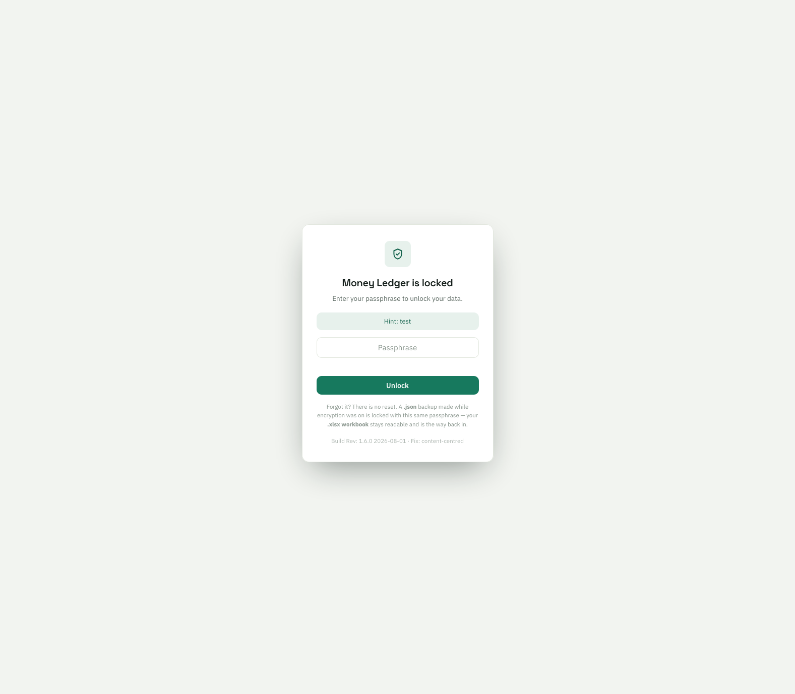
The lock screen, stating the dead end
Left:“You have never exported a backup. A workbook is the only copy that survives losing
access to this app.” Most software that holds your only copy of something never mentions it.
Right:“Forgot it? There is no reset.” — stated flatly, and then the way out in the
same breath: the encrypted backup is locked with that same passphrase, but the spreadsheet export
stays readable and is the route back in. Most software either implies a recovery path that does
not exist or leaves you to find the dead end yourself. The full-page takeover is deliberate:
when the app is locked there is no app, only the lock — nothing is dimmed-but-visible, because
nothing is available.
09 What assembling this evidence found
Shooting these captures was not a photo session — it was a review pass, and the same thing happened
that happened on the Homestead set. A full audit ran immediately before capture and the
static half came back clean: every interaction handler accounted for, tokens complete across all
eleven themes, 344 assertions green. The capture session then found defects anyway,
because driving a product for an outside audience asks questions that normal use never asks.
Defects logged
4
on capture day, 1 Aug
Found by a person
3
one caught by a linter
Takes on the hero
4
to get one frame right
Shots skipped
1
claim carried better elsewhere
What was wrong
How it surfaced
Why it mattered
The month arrows had never been visible
Christopher, being told how to change the month for a screenshot — “there are no arrows”
The control existed and drew nothing, so the app had behaved for weeks as though it had one month
The budget grid could not be widened
Trying to fit a fourteen-column grid in frame and finding the browser made no difference
A width cap that was not relative to the window — the boundary looked like a layout choice and was a bug
A placeholder payee in the most-read panel
Reading the dashboard capture before promoting it
TestJson / TestJson sitting in Recent activity — exactly the leak the capture plan warns about
Ten stray commas left by a reordering
A linter, in the pre-shoot gate — the one machine catch of the day
The app would not open on ten of its eleven themes; pushed and live for four hours
Why this section is in a portfolio
Three of the four were found by a person looking at output and refusing to accept it. The fourth was found by a linter — and it is in the table for that reason. The honest claim is
not that automation catches nothing; it is that automation catches the class of fault it was written
for, and a control that renders nothing, a cap that cannot be widened, and a placeholder in a
screenshot are all outside it. Knowing which answer is wrong when nothing has failed is the
judgment the job is for.
10 Reading these images honestly
What was staged, what was computed, and what a careful reader would want to know — stated here rather
than left to be discovered.
In the images
Status
The dataset is synthetic
Deliberate and non-negotiable. 352 transactions across 19 months, 4 accounts, 22
categories, ~30 invented payees. Christopher runs this app on his real finances daily; none of
that appears here or ever will. The volume is realistic — the money is not real.
§01 and §04 are staged
Both, and neither was saved into the record. The source file contains no
mis-signed account and no split transaction, so each had to be created to screenshot the
behavior. The split modal was closed without saving; the test credit card was removed
afterwards by restoring the file.
§05 shows a typed statement balance, not a committed reconciliation
Typing a balance and reading the hint changes nothing. Finish was deliberately not
clicked — it writes cleared flags to every ticked entry and would have broken the
dataset for every later shot.
§06 had to be shot in August, and §07 in the 2025 financial year
Both are consequences of correct behavior rather than workarounds. The balance sheet
suppresses itself on a past period; the budget grid defaults to a mode where nothing has
been budgeted yet, and to a financial year that is only seven months populated.
§03 is not eleven photographs
Three of the eight image-backed themes were rebuilt from generations Christopher
art-directed, not photographs he took. The distinction matters on a page arguing
authorship, so it is stated rather than blurred. The claim is that nothing in the grid is
of unknown origin — not that every frame came out of a camera.
§04's middle category is Miscellaneous
A small loss, recorded rather than hidden. An earlier take read Groceries / Shopping /
Personal Care — one receipt landing in three real budgets — which made the point more
sharply than a catch-all does. The claim survives; the sharper version does not.
Several frames carry a lot of empty ground
Working as intended. The report is a centered document and the lock screen is a card on an
empty field; both were captured at the set width because a single rig width across the set
is the rule, and cropping is a layout decision made later.
MoneyLedger — a private, offline personal-finance ledger that lives in a single HTML
file: no cloud, no account, no network, no third-party JavaScript. Concept, product design, UX,
branding and AI direction by Christopher Ward; built with Claude against a written operating contract.
In daily use on his own finances. Captures 1 August 2026, Rev 1.6.0, against a synthetic dataset.